Inclusive design · Android concept
Giving people with colour blindness their independence back.
- Type
- Inclusive design concept
- Year
- 2026
- Platform
- Android
- Methods
- Literature review, interviews, affinity mapping
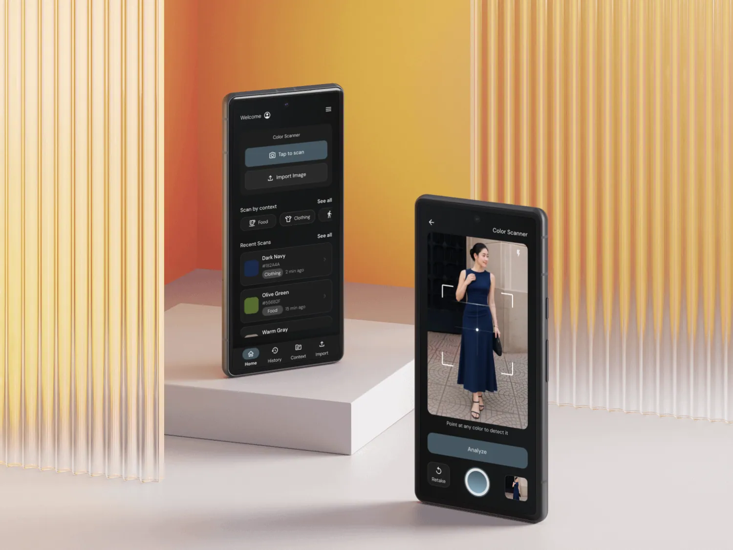
At a glance
Problem
People with colour blindness rely on others to tell colours apart. Existing apps give vague answers like “green” that can't be acted on.
Solution
A camera-first Android app calibrated to your type of colour vision deficiency, giving precise names, hex codes and context.
My role
Research, task flows, information architecture, wireframes and hi-fi UI.
Outcome
A research-grounded concept. It hasn't been built or tested with users yet.
Problem
Colour carries meaning. Not everyone can read it.
Status lights, charts, traffic signals, food and clothing all use colour to communicate. Most tools offer one generic red-green filter, yet each type of colour vision deficiency changes perception differently.
8%
of males have colour vision deficiency
0.5%
of females
34%
of people with CVD feel limited in career choices
Insights
What the research showed
“It just says green”
Both interviewees, with different CVD types and lives, said the same thing about existing apps.
No universal filter
Research shows what helps one type of CVD can make things worse for another.
Compliance isn't usability
Interfaces that pass WCAG can still confuse people with CVD.
Key decisions
How the design answers it
- 01
Ask who you are before anything else
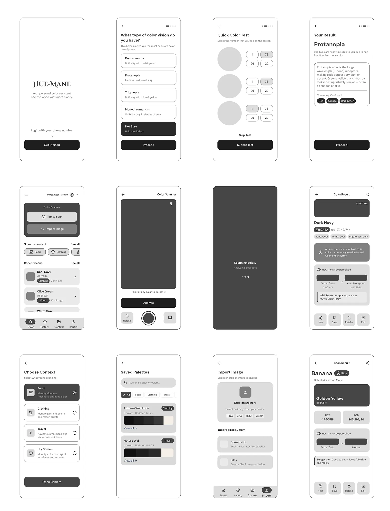
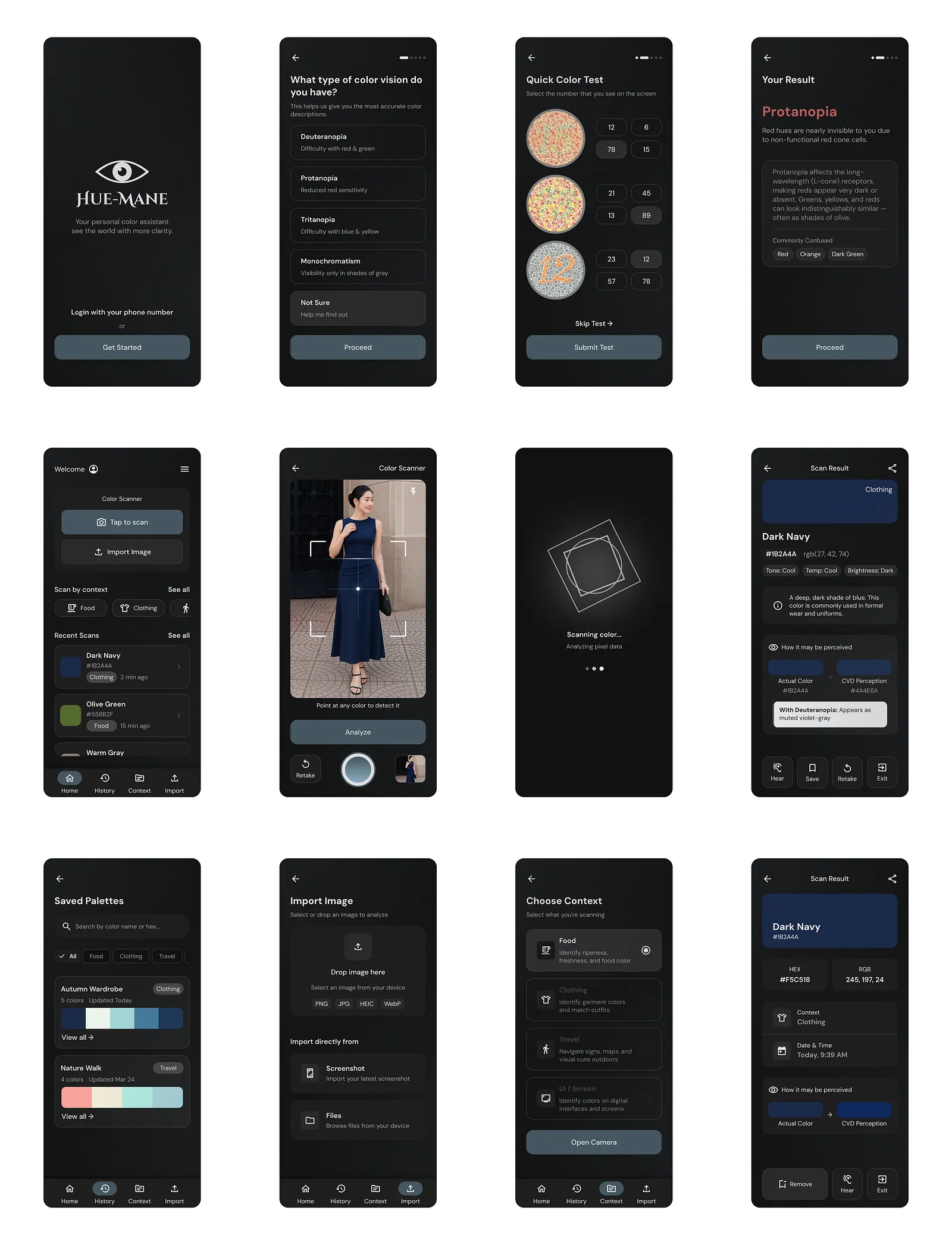
Onboarding sets up your CVD type, so the very first result is already calibrated to how you see.
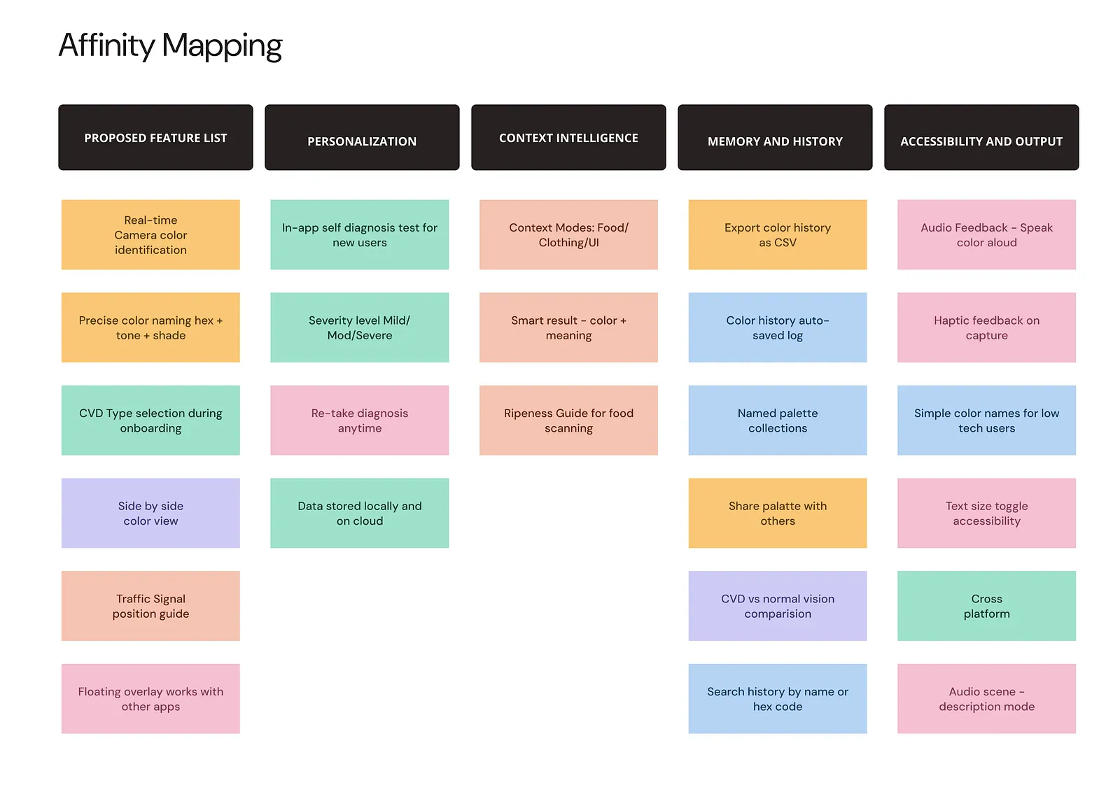
Features clustered from research, then prioritised into three tiers. - 02
Keep the camera one tap away
Scanning is the main action for both personas, so the information architecture puts it at the centre and tucks settings away.
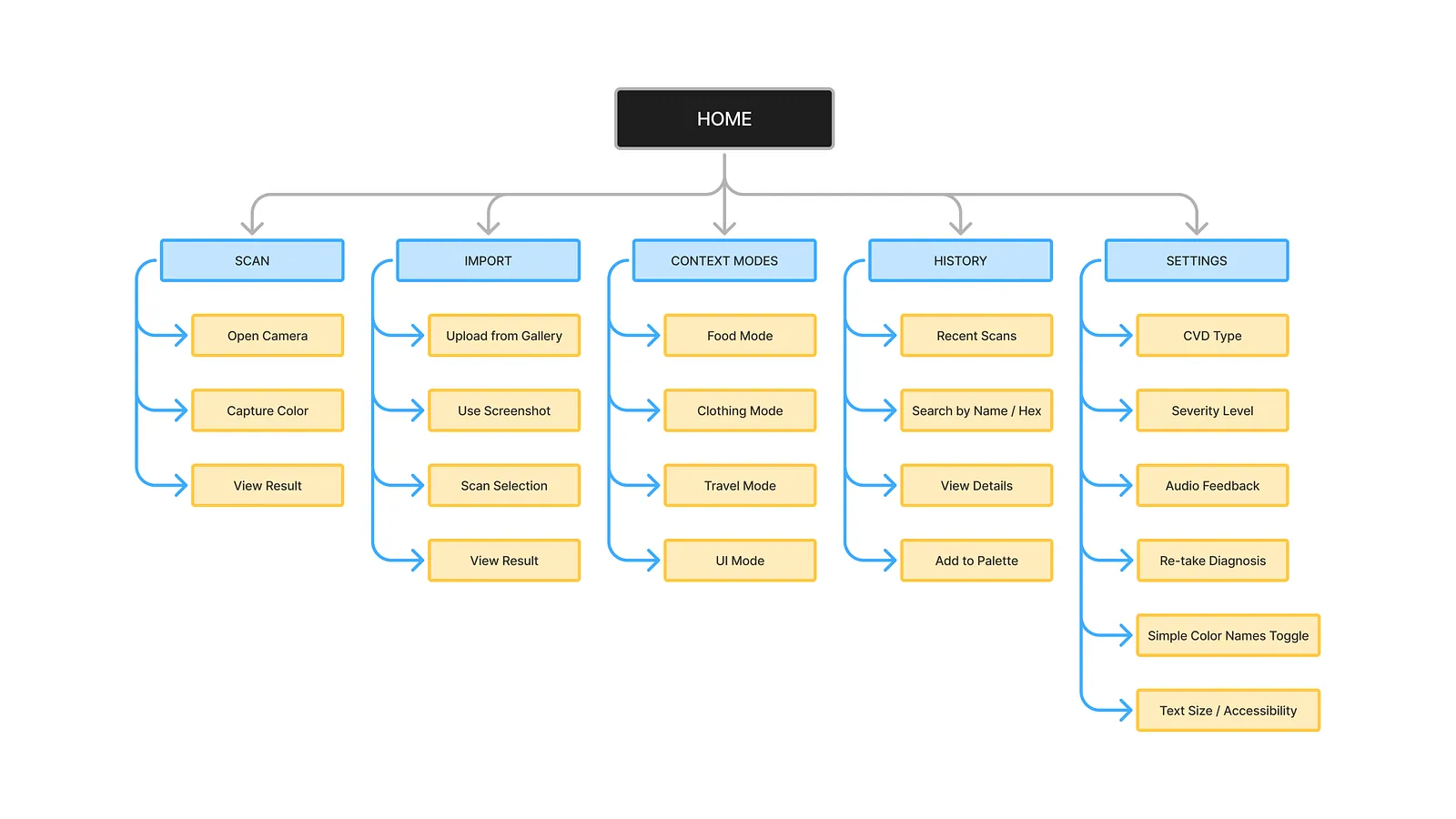
Five sections, one home. - 03
Precision as the default
Every result gives a hex code, tone name and shade, plus context modes for food ripeness and fabric. An app for accessibility must itself be accessible, so it adds audio feedback and text size controls.
Final design
The screens
Outcome
What I learned
- Two very different people sharing one frustration is what defines a real design opportunity.
- Inclusive design means going past the accessibility checklist and into lived experience.
Want the full process? Read the original write-up on Medium(opens in a new tab).